How do I find good images?
There is a host of royalty-free image banks – here are some of the best (make sure to check the terms before using):
If you still can’t find what you want – there are paid services such as:
What size/resolution should the image be?
Fliplet’s rules of thumb:
-
Mobile images minimum width (or height) of 500px ( 750px is more comfortable)
-
Desktop images minimum width (or height) of 2000px ( 3000px is more comfortable)
-
Use a free compression tool if you are concerned about size – eg, www.TinyPNG.com
Choosing an image size is a balance between loading speeds and image quality. You don’t want your image to look grainy or pixelated but you don’t want it to take ages to load either.
On the whole – loading times are becoming less of an issue as internet speeds are increasing and low-quality images are becoming more noticeable as screen resolutions are improving.
Which images look good both on desktop and mobiles?
Fliplet’s rules of thumb:
-
Landscape images look better on desktop.
-
Portrait images look better on mobile.
-
Ask yourself if you really need the image to work on both platforms.
-
If you do need an image to look good on both desktop and mobile screens:
-
Try to choose an image where the focus points are in the centre.
-
Try using a square image as it’s neither to landscape nor to portrait.
-
-
If you want a logo to look good on two platforms – you can select a layout that has an image with a content overlay. This allows the logo and the background image to re-size independently of each other – the background image may get cropped but the logo will be re-sized to fit in the centre of the image.
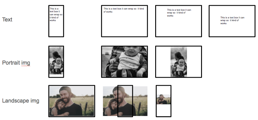
The fundamental challenge is that a full-screen dramatic image cannot fit both portrait or landscape orientations without quite a bit of cropping on one or the other. However, some techniques make images more compatible with both orientations.
Below is an illustration of the challenges when changing text and photos between layouts.

We recommend using a square image where the key points of interest are in the centre so that the cropping is not too severe in any orientation.
Tips for using images as a background
Fliplet’s rules of thumb:
-
Use an image that is relatively plain and not too fussy/busy as it could distract the viewer from what you want them to focus on.
-
Make the image contrast with the content overlaid – ie, if the image is dark make the text light.
-
Think about blurring the image or changing its brightness to help the contrast.
-
Potentially add a shadow to your content to make it stand out.


Common errors to avoid with images
Fliplet’s rules of thumb:
-
Avoid using small images on a big screen, they will look pixelated with square/flat edges.

-
Avoid using busy or cluttered images as backdrops, they will compete with any overlay – see above.
-
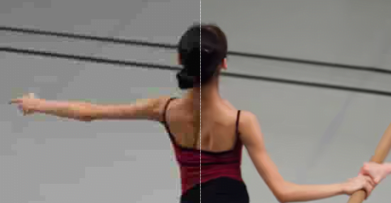
Avoid poor quality JPEGs that have been over-compressed, strange distortions and image artefacts will appear like in the left image below.

Related Articles