The Gallery component enables you to display multiple images in a slideshow style format inside your app. It is useful for creating photo albums, visual portfolios, or image collections that users can browse through. Supported formats include PNG, JPEG, GIF, and TIFF.
How to use a Gallery Component?
Get started
Adding images to your gallery
You can add images to the gallery using the file picker. This tool lets you:
- Browse existing files already uploaded to your app’s media library
- Drag and drop new uploads directly into the picker
- Select files from your computer to upload
Once images are added, they appear in the configuration panel. Each image can be managed individually, making it easy to organize and update your gallery content.
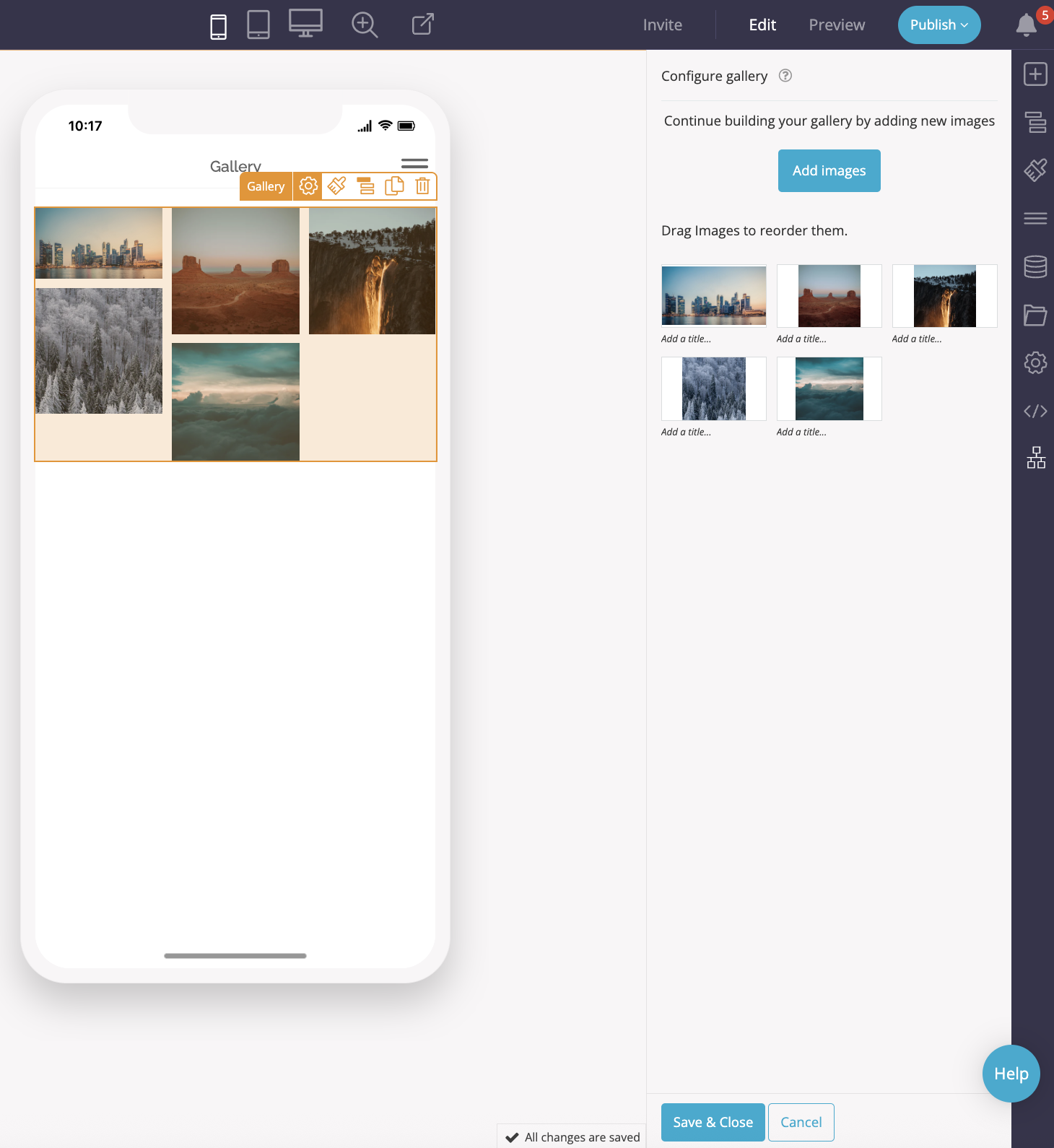
Managing gallery content
For each image in your gallery, you can:
- Set an image title – this appears as a caption below the image
- Edit the image – crop, resize, or rotate using Fliplet’s built-in image editor
- Reorder images – drag and drop rows in the list to adjust the display order
- Delete images – remove any unwanted images with a single click
You can return to the file picker at any time to add more images and expand your gallery.
Customizing gallery appearance
The Gallery component includes appearance settings to help you control layout and alignment across devices. You can:
- Adjust the layout for phone, tablet, or desktop views
- Set the gallery width (100%, auto, min, none, or max)
- Define margins – top, bottom, left, and right
- Control padding – inner spacing around the gallery
These settings enable you to fine-tune the gallery’s placement on the page and ensure it aligns well with other components. Changes save automatically, and you can exit the appearance panel by selecting another tool.
Key benefits
The Gallery component provides a flexible way to present multiple images in your app. With options for captions, image editing, reordering, and responsive layout adjustments, it gives you full control over both the content and its appearance.
Related Articles