What are the LFD Appearance Settings?

The LFD Appearance Settings allow you to control how your LFD appears to users. You can set colors of different text within the component as well as fonts, layout, design, and more. This ultimately gives you control over the visual and aesthetic appearance of your LFD app screen.

Why use the LFD Appearance Settings?

The appearance settings ultimately allow you to design how your LFD will appear to users. This can help you make your app more user-friendly. Without the LFD appearance settings, you would have less control over how your app appears to users. The LFD Appearance Settings also allow you to make your app unique in its appearance and fit with your brand guidelines.

LFD Appearance Settings options:

  1. Directory
  2. List – Horizontal tiles
  3. List – Calendar (Agenda)

Options of the LFD Appearance Settings: Directory

Width

Allows the width of the LFD component to be set. The following options are available:

  • Width
  • Max Width

Positioning

Where the component is on the screen. The icons let you choose what the position of the component is based on:

  • Block Stack – relative to the components current positioning
  • Relative to screen – fixed positioning based on the screen so the component will not move for scrolling
  • Relative to container – absolute positioning based on the container

Layer Order

The following options are available:

  • Auto
  • Index

Margin

Allows setting of left, center, or right margins. Set the size of the margins at the top, bottom, right, and left

Padding

Similar to the Margin option. The spacing on the inside of the component. Set top, bottom, left, or right. Enables adjusting of the size of the extra space
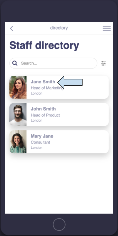
List Item Title

Allows you to change the following aspects of the title of each list item:

  • Font – the font of the title
  • Font size – the font size of the title
  • Font color – the color of the font used in the title
  • B, L, I, U – Make the font of the title bold, lighter, italic, or underlined
  • Line height – where the text position is in relation to the individual list item
  • Margin top – the amount of space above the title text within the individual list item.
  • Margin bottom – the amount of space below the title text within the individual list item

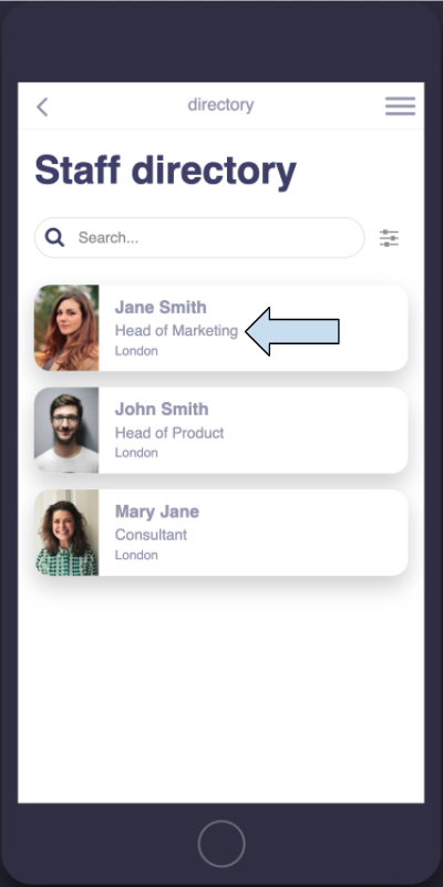
List Item Description

Allows you to change the following aspects of the first description of each list item:

  • Font – the font of the first description of the list item
  • Font size – the font size of the first description of the list item
  • Font color – the color of the font used in the first description of the list item
  • B, L, I, U – Make the font for the first description of the list item bold, lighter, italic, or underlined
  • Line height – where the text position is in relation to the individual list item
  • Margin top – the amount of space above the first description of the individual list item
  • Margin bottom – the amount of space below the first description of the individual list item

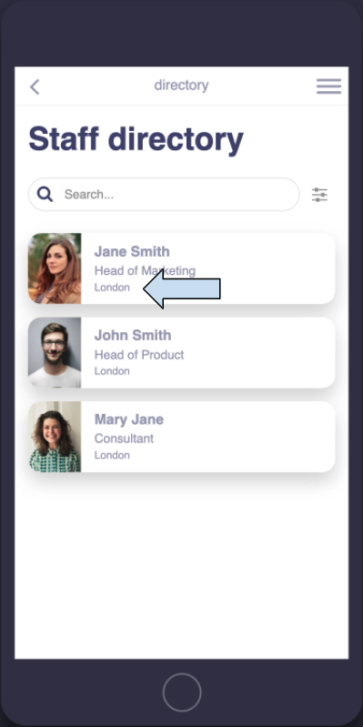
List Item Second Description


Allows you to change the following aspects of the second description of each list item:

  • Font – the font of the second description of the list item
  • Font size – the font size of the second description of the list item
  • Font color – the color of the font used in the second description of the list item
  • B, L, I, U – Make the font for the second description of the list item bold, lighter, italic, or underlined Line height – where the text position is in relation to the individual list item
  • Margin top – the amount of space above the second description of the individual list item
  • Margin bottom – the amount of space below the second description of the individual list item

Detail Overlay Title

To find the Detail Overlay Title, go to “Preview Mode” and click on a list item. The title refers to how the title appears in that particular view

The Detail Overlay Title is the title as it appears in Preview mode when you click on one of the individual list items to open it. The following options can be set:

  • Font – the font of the
  • Detail Overlay Title Font size – the size of the Detail Overlay Title’s font
  • Font color – the color of the Detail Overlay Title’s font
  • B, L, I, U – make the font for the Detail Overlay Title bold, lighter, italic, or underlined
  • Line height – the space between the Detail Overlay Title and the line below it.

Detail Overlay Description

The Detail Overlay Description is directly underneath the title. It is the first description of the list item.

  • Font – the text font of the Detail Overlay Description
  • Font size – the size of the Detail Overlay Description’s font
  • Font color – the color of the Detail Overlay Description’s font
  • B, L, I, U – make the font for the Detail Overlay Description bold, lighter, italic, or underlined
  • Line height – the space between the line and the Detail Overlay Description below it
  • Margin Top – The margin between the Detail Overlay Description and the Detail Overlay Second Description from the top
  • Margin Bottom – The margin between the Detail Overlay Description and the Detail Overlay Second Description from the bottom

Detail Overlay Second Description

The Detail Overlay Second Description is directly below the Detail Overlay Description. The options are:

  • Font – the text font of the Detail Overlay Second Description
  • Font size – the size of the Detail Overlay Second Description’s font
  • Font color – the color of the Detail Overlay Second Description’s font
  • B, L, I, U – make the font for the Detail Overlay Second Description bold, lighter, italic, or underlined
  • Line height – the space after the line below the Detail Overlay Second Description
  • Margin Top – the margin (space) above the Detail Overlay Second Description
  • Margin Bottom – the margin (space) below the Detail Overlay Second Description

Detail Overlay Text

The Detail Overlay Text is the longer text below the Detail Overlay Descriptions. The Detail Overlay Text options are:

  • Font – the text font of the Detail Overlay Text
  • Font size – the size of the Detail Overlay Text
  • Font color – the color of the Detail Overlay Text’s font
  • B, L, I, U – make the font for the Detail Overlay Text bold, lighter, italic, or underlined
  • Line height – the space between the lines of the Detail Overlay Text
  • Margin Top – the margin directly above the Detail Overlay Text
  • Margin Bottom – the margin directly below the Detail Overlay Text

Detail Overlay Labels

The Detail Overlay Labels are the labels that appear below the Detail Overlay Second Description. The Detail Overlay Labels option are:

  • Font – the text font of the Detail Overlay Labels
  • Font size – the size of the Detail Overlay Labels text
  • Font color – the color of the Detail Overlay Label’s font
  • B, L, I, U – make the font for the Detail Overlay Labels bold, lighter, italic, or underlined
  • Line height – the space between the lines of the Detail Overlay Labels
  • Margin Top – the margin directly above the Detail Overlay Labels
  • Margin Bottom – the margin directly below the Detail Overlay Labels

Colors

The following options are the color options available for the different texts, lines, backgrounds, etc. of your app:

  • List item background
  • Detail overlay background
  • Detail overlay line under title
  • Detail overlay icons
  • Detail overlay background
  • Filters overlay text
  • Filter icon
  • Filter icon active
  • Search icon
  • Search field border color
  • Search field border color active
  • Bookmark icon
  • Bookmark icon active
  • Image area background
  • Add button background color
  • Add button icon color

List Item Border

The list item border is the border around each list item. The options available are:

Choose where you want the list item border to show:

  • None – no list border
  • Top – A border just on the top
  • Right – A border just on the right
  • Bottom – A border just on the bottom
  • Left – A border just on the left
  • All Sides – A border on all sides of the list item

You can also select how you want the border to appear including color, style, and size.

List Item Shadow

The List item shadow is the gray shadow that exists around each list item. Options for the List Item Shadow are:

  • Whether the shadow is directed outwards, inset, or none.
  • X offset – how far the shadow protrudes from the list item on the x-axis (horizontally)
  • Y offset – how far the shadow protrudes from the list item on the y-axis (vertically)
  • Blur – how blurry the shadow is
  • Spread – how far the shadow spreads across the app screen
  • Colour – click on the box to choose the color and transparency of the shadow

Visibility

Choose whether the list items are visible or hidden from view

Options of the LFD Appearance Settings: List – horizontal tiles

Note: The categories and descriptions are the same as the List – directory above, with the following exceptions: 

Colors

  • List item background
  • Detail overlay background
  • Detail overlay line under title
  • Detail overlay icons
  • Image area background

Options of the LFD Appearance Settings: List – Calendar (Agenda)

Note: The categories and descriptions are the same as the List – directory above, with the following exceptions: 

List Item Time

Allows you to change the following aspects of the time of each list item:

    • Font – the font of the time of the list item
    • Font size – the font size of the time of the list item
    • Font color – the color of the font used in the time of the list item
    • B, L, I, U – Make the font for the time of the list item bold, lighter, italic, or underlined
    • Line height – where the time text position is in relation to the individual list item

Colors

The following options are the color options available for the different texts, lines, backgrounds, etc. of your app:

  • List item background
  • Detail overlay background
  • Detail overlay line under title
  • Detail overlay icons
  • Detail overlay background
  • Filters overlay text
  • Filter icon
  • Filter icon active
  • Search icon
  • Search field border color
  • Search field border color active
  • Bookmark icon
  • Bookmark icon active
  • Agenda Top Bar Background
  • Agenda Top Bar Text
  • Agenda Top Bar Active Text
  • My Agenda Button Background
  • My Agenda Button Text
  • Add Button Background Color
  • Add Button Icon Color


Related Articles

Was this article helpful?
YesNo