What is the layout editor?
The layout editor manages how screens and layouts are built in Fliplet Studio.
Apps need to work on a wide variety of screen shapes and sizes – including landscape desktop screens and small portrait mobile screens. Consequently, components in an app need to wrap, stretch, and scale to fit the different screen sizes. This is different from a fixed canvas layout system used by PowerPoint and others where the canvas never changes shape.
How to Use the Layout Editor
Check out this video of a live demo creating a sample screen with the layout editor or look at other samples in the article below.
How does this work?
Fliplet apps use the same approach as website designers – “responsive” layouts. This means layouts are defined by the relationship between the components rather than a fixed location – eg, two elements have a certain margin between them, a fixed distance from an edge, or will fill the space left in a row. So if one element gets bigger it will ‘push’ its neighbor down a row.
To precisely position a component on a screen you typically need to use a combination of appearance settings (to set size, margins, positioning-type) and possibly a container component to specify a relationship between your other components (to specify alignment, wrapping, grouping). For more information on container components please visit this article.
What can I do with the drag and drop system?
Click the links to skip to a section:
- Placing components in a column
- Creating layouts for wide and narrow screens (ie responsive design)
- Placing components in a row
- Creating scrollable areas
- Creating layered or overlapping designs
- Creating full-width images (without skewing the image)
- Creating full-screen layouts
- Centering components horizontally and vertically
- Centering text on a screen but keeping it left-aligned
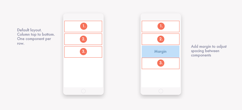
Placing components in a column
By default Fliplet components will line up in a column – top to bottom – with typically one component per row. Spacing of the elements can be achieved by changing their margins and paddings. This is often all you want for a mobile screen. However, you may want to consider different options for desktop screens and rows.
Creating layouts for wide and narrow screens (ie responsive design)
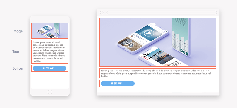
A layout that works well for narrow mobile screens is often not suitable for landscape widescreens found on desktops. Desktops offer more space allowing your components to expand, scale, and unwrap. However, you may not want the image to become so big or the text expands to the full width of the screen making it hard to read (see the example in the image below).
Making layouts change as the screen size changes is called “responsive” design. There are several settings that allow you to create responsive layouts. They are:
-
Using ‘%’, ‘vw’ or ‘vh’ to describe size and distance. For example, the width of a component can be a fixed number of pixels (eg ‘500px’) but it can also be expressed as 50% of the space available or 50vw (which means 50% of the screen’s view width regardless of the container a component sits in. ‘vw’ and ‘%’ will effectively be the same if there isn’t a container and the % will refer to the screen width).
-
Using maximum and minimum widths. If you have set the width to be 100% of the space available – this may look great on small and medium sized screens but on really wide screens you may want to set a maximum width. For example, it’s a good idea not to let lines of text go wider than 800px, and letting images get too big may make them look pixelated and blurry.
-
Manually setting the appearance for different device types (breakpoints). You can set appearance settings for mobiles, tablets, and desktops by switching the screens using the screen shape menu. NB: To make setting styles faster, the styles set on mobile devices are inherited by tablet devices, and tablet styles are inherited by desktop devices unless set otherwise. This means that practically you want to make your changes on mobile first to save yourself manually duplicating appearance settings.
-
Wrapping components at different screen widths. Many people are familiar with ‘wrapping’ from using a text editor. If the width of the container gets smaller, its contents do not get smaller – it simply wraps around into the next row below. This can be achieved by using a container component and ensuring that its appearance settings allow for the wrapping of its contents.
-
Hiding or showing a certain component at different screen widths. Sometimes adjustments to the size of a component is not enough – it’s better just to not show it at certain screen widths (or hide it and show a different option in its place). For example, you may want to hide a large image menu and replace it with a smaller text menu on mobiles. You can do this using the container component. Add the elements you want to show or hide to the container. Then change the visibility of the container for different mobile, tablet, and desktop screen sizes (using the ‘visibility’ setting in the appearance menu). NB: If you need to find the component after you’ve hidden it you can do this in the screen structure menu.
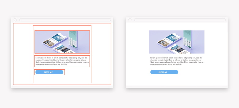
Often you will use a combination of the above to achieve what you’re looking for. For example, based on the image above, a sensible approach is to set maximum widths for components and center them on the screen. There are a few ways to do this but one of the simplest is to use container components to group everything together and set a maximum width for all components. In the example below we’ve actually used two container components. One to contain all its contents at maximum width and another component to center the contents on the screen (NB you can also center items horizontally by setting left and right margins to ‘auto’).
Placing components in a row (and wrapping the row for narrow screens)
By default components will line up in a column – one above the other, top to bottom. Switching this so that the components line up in a row is relatively simple with the use of the container component. To do this:
-
Add a container component to the screen and drop the contents you want into it.
-
Go to the appearance settings of the container component (you can get to the appearance settings via the Screen Structure menu if the component is difficult to click on).
-
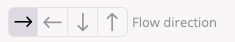
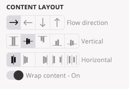
Once in the container component’s appearance settings – you can change the direction of the layout using the “Flow direction”
Creating scrollable areas
Making sections of your app scrollable is a good way to pack in extra content, especially on small mobile screens. For example, a horizontal scrolling list of stories. You can do this using a container component.
Step 1: The first step to do this is to add a container component to your screen and place your content inside it.
You’ll notice that the content will initially wrap inside the container and may increase the container’s size. What we want is for the container to stay the same size and for the content to scroll within it. So step two and three are:
Step 2: Set the size of the container to the size of the scrollable area you want (you may not need to do this for horizontal scrolling as the container width is already limited by the screen width)
Step 3: In the container component appearance settings turn off content wrapping
You’ll now have the container looking the correct size but the content inside it is probably squashed. This is because, by default, the container changes the size of its contents to try and fit is all in. We need to force the contents to stay the size we want it to be.
Step 4: Make sure the contents of the container doesn’t get squashed by setting their minimum width (or minimum height for vertical containers).
We’re very nearly there. The container and content is looking correct but the contents do not scroll.
Step 5: In the container component appearance settings change the overflow settings. Set ‘overflow-x’ to ‘scroll’ for horizontal scrolling (or overflow-y for vertical).
Creating layered or overlapping designs
By default, screen components have a Positioning setting that causes them to ‘bump’ into each other. They are unable to overlap. This is great for responsive layouts where we want components to stretch and rearrange as screen sizes vary. However, it doesn’t allow components to overlap. A common design requirement is to show items in front of one another eg: text floating in front of an image or a menu button that floats on top of the screen’s content.
There are a few ways to do this:
-
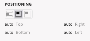
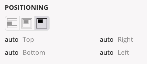
Position relative to the screen. This will make the element look like it’s stuck to the glass of your screen. When the rest of the screen scrolls it will remain fixed in place. This is commonly used for menu headers that you want to be able to access at all times. The distance from the screen edges is set using the top, right, bottom, left settings.
-
Position relative to a container. This defines the position of an element relative to its container. Unlike positioning relative to a screen, positioning relative to a container allows an element to scroll with the screen background. The distance from the edge of the container is specified using top, right, bottom, left. If you haven’t specified a container for the component you are editing then it will use the default screen container.
-
Adding an element to a container component that’s had its positioning changed. Container components can be used to position a group of components simultaneously. Changing the positioning of the container will change the positioning of its children (assuming they are not already positioned relative to the screen).
Creating full-width images (without skewing the image)
The simplest way to get a full-width image is to use an image component and set its width to 100% (ie, fill 100% of the width available). But there’s a catch. The image height will increase at the same rate as the width (if the height is set to ‘auto’). On wide screens, this can often lead to images taking up a lot of vertical space. You can set the height of the image to a fixed value but this will cause your image to skew and become squashed.
Slightly counter-intuitively, the best solution is to use a container component. A container component allows you to set its background (in the appearance settings) to display an image.
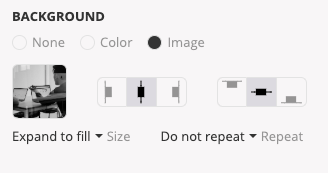
You can then set the height of the container component and choose how you want the image to be displayed within it without the image becoming skewed.
Creating full-screen layouts
You may want a particular layout to fill the screen. But you may not know what shape or size a user’s screen will be. To work around this you can use a container component to fill the space and place any content you want in it. To make the container component fill the screen you can change its positioning (found in its appearance settings) to be “relative to container” and ‘bottom’ to ‘0px’ (this forces the bottom of the container to be next to the bottom of the screen). You can then define the position of your screen contents relative to the container component. NB: if you’ve got more content than the size of the container then you will need to set the container’s ‘overflow’ property to ‘auto’ if you want to make the content scroll into view.
Centering components horizontally and vertically
The simplest way to center a single component (or a group of components) is to use a container component. The container has several settings that let you control the layout of its contents – including centering it horizontally and vertically.
For centering to work, you need to define the height and width of the container so that it’s possible to deduce the center. Width typically works by default as the width of the container is set to 100% which is often defined by the width of the screen. Height is not as obvious. The default is that the height of the container is the same as its contents (‘auto’). So by definition the contents is already in the middle. Defining the height as 100% may also fail to work as a screen can be infinitely long to allow for scrolling – so defining a height as % of infinity doesn’t make sense. The solution is to fix the height in absolute terms (eg by using pixels ‘px’) or by positioning the container relative to its container and stretching it by setting the distance from the edges to 0px (set top, bottom, left, right to 0px).
Centering text on a screen but keeping it left-aligned
If you want to center text horizontally on a widescreen it is tempting to set the text alignment to center. However, this looks odd for long paragraphs as it will have ‘rough edges’ on both sides of the text. Instead, it’s better to keep the text left-aligned (and set a maximum width if you don’t want it to get too wide). Then center the entire text component by putting it in a container component. You can use the container’s appearance settings to center the text component.
Related Articles