Get started
This article will cover the follow
- What are the accordion components?
- Why use the accordion components?
- How to use the accordion components
- Options of the accordion component
- FAQ’s
What are the accordion components?
Accordions refer to content areas that expand when clicked. Widely used in web and mobile design, accordions are particularly suitable for mobile apps, given the limited screen space on mobile devices.
In Fliplet, accordions are created using two components, namely:
- Accordion Heading
- End of Accordion Group
Accordion headings group content together. In your app, accordions will show the headings initially. When you click the heading, it expands and displays the content found below the heading. Other Fliplet components can be used to display content in an accordion.
End of Accordion Group is typically used at the bottom of a group of Accordion Headings, separating the group from other content sections. They can also be used to divide several accordion headings into separate groups of independent collapsible sections.
Why use the accordion components?
Accordions are used for hiding and expanding content in your app. They are useful for various reasons, including:
-
Adding lengthy pieces of static content such as a privacy notice and descriptions of things that can be shortened.
-
Highlighting different sections of a screen without having all the details visible at once. This leaves the user with the option to expand the sections depending on their interests.
There are many other areas where you can use accordions. You should be able to determine what these are as you go about designing and developing your app.
How to use the accordion components
Options of the accordion components
The option below is only available to the Accordion Heading component. It’s just a single option since you have to insert your content directly below the Accordion Heading title. The End of Accordion Group component does not have any options as it only serves to group one or more accordions together. Be sure to add both components to have your accordion function correctly.
|
Accordion title (Accordion Heading only) |
The name that will be displayed on the Accordion on the app screen |
FAQs
- How to add an accordion inside of another accordion
-
- Add all of your accordions as per usual (drag and drop them on the screen)
- Open the developer options using the toolbar on the right and look at the screen html
- Find the accordion components that you want to have nested
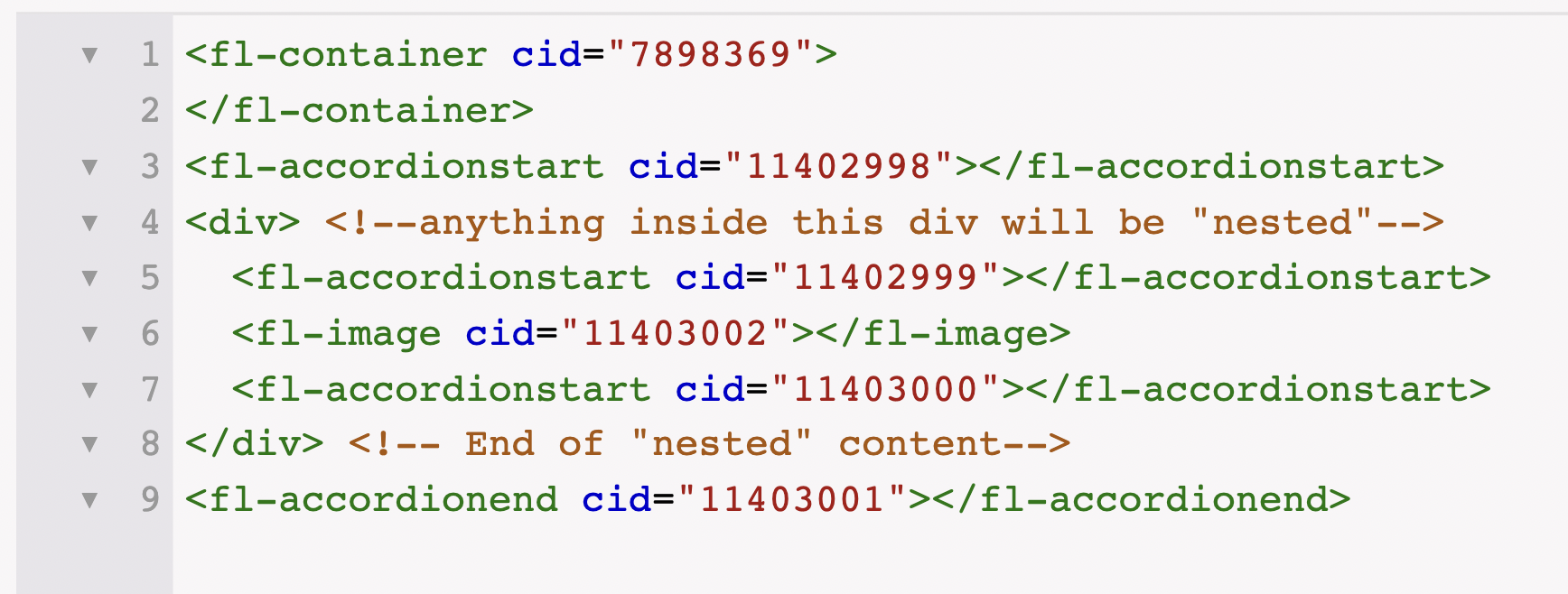
- Around that specific accordion and its content, you need to add a custom div that wraps around it

- The custom div will create the nested accordion area – any accordions within the div will be nested
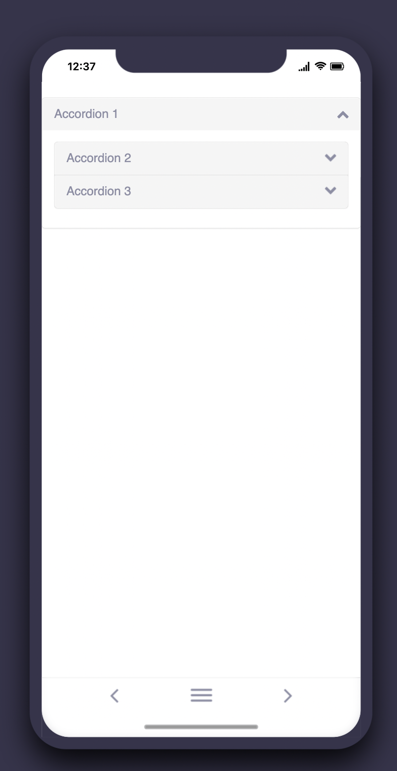
- For this example, accordion 2 and 3 will sit inside accordion 1
