Using the slider component in Fliplet Studio will enable you to create multi-step forms and enhance user experience by breaking down lengthy forms into manageable steps.
This article explains how to use Fliplet’s Slider component to build a multi-step form by organizing content across multiple slides within a single screen.
We have also created a screen template to give you a pre-made example. If you chose to start by using the screen template you can skip to step 3 where you can follow the instructions to further customize your form.
To find the screen template, click the “add screens” button inside your Fliplet app and add the “Multi-step sign up” screen to your app.
Get started
- Add the Slider component
- Configure slider settings
- Add slides for each step
- Add forms to slides
- Customize form fields
- Add navigation buttons
- Add the submit button
- Preview and test the form
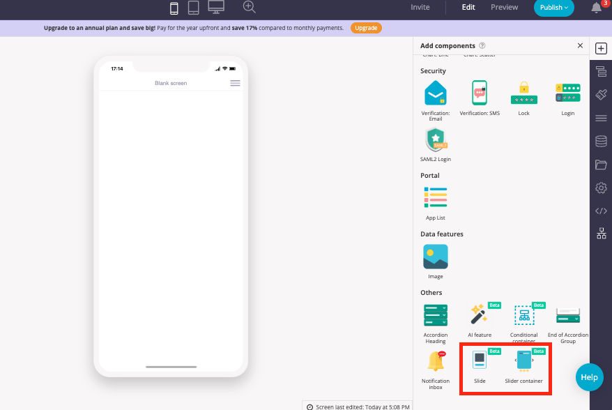
Step 1 – Add the slider component
- Start by opening your app and navigating to the screen where you want to add the form
- Open the component library
- Drag and drop the Slider container component onto the screen
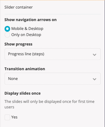
Step 2 – Configure slider settings
- Choose where to display navigation arrows:
– Mobile & Desktop
– Only on Desktop - Select how to show progress:
– Progress line
– Pagination bar
– Pagination dots - Choose a transition animation:
– Slide
– Fade
– None - Enable or disable “Display Slides Once”
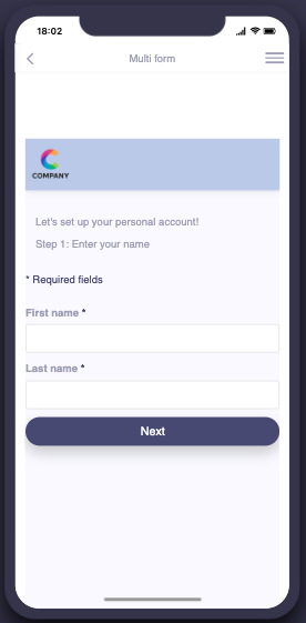
Step 3 – Add slides for each step
- From the component library, drag and drop the slide component into the slider container. Each slide will be a new part of the form
- Configure each slide:
Mark if it contains a required form
Set navigation restrictions to control movement between slides - Your screen and screen structure should look like the following:
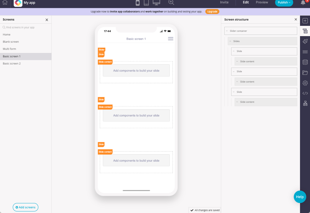
- This screen has one slide container and three slides.
Step 4 – Add forms to slides
- Within each slide, drag and drop the form component
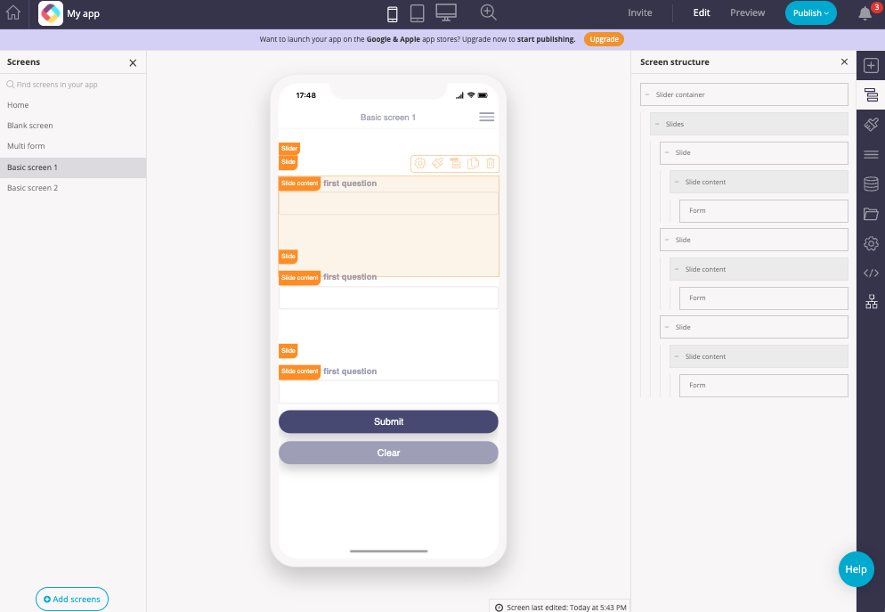
- Make sure to connect all forms to the same data source to ensure unified data submission.
Step 5 – Customize form fields
- Add relevant input fields (e.g., text, dropdown, checkbox)
- Set validation rules as needed (e.g., required fields)
- To learn more about the form component and each form field, see here.
Step 6 – Add navigation buttons
Next Button:
- Add a button form field to each form (except the last one, as this should include the submit and clear buttons)
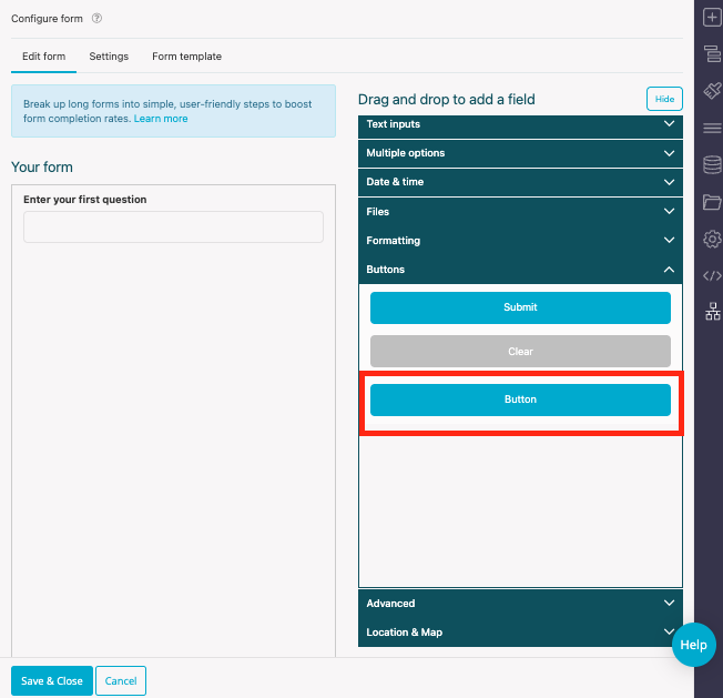
- Open the button settings, click the drop down next to “link action” and set the action to “Go to Next Slide”
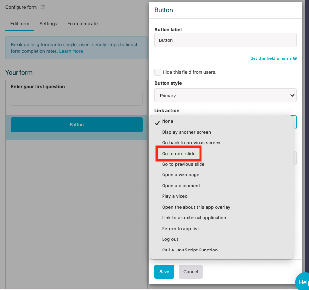
- Label the button (e.g., “Next”, “Continue”)
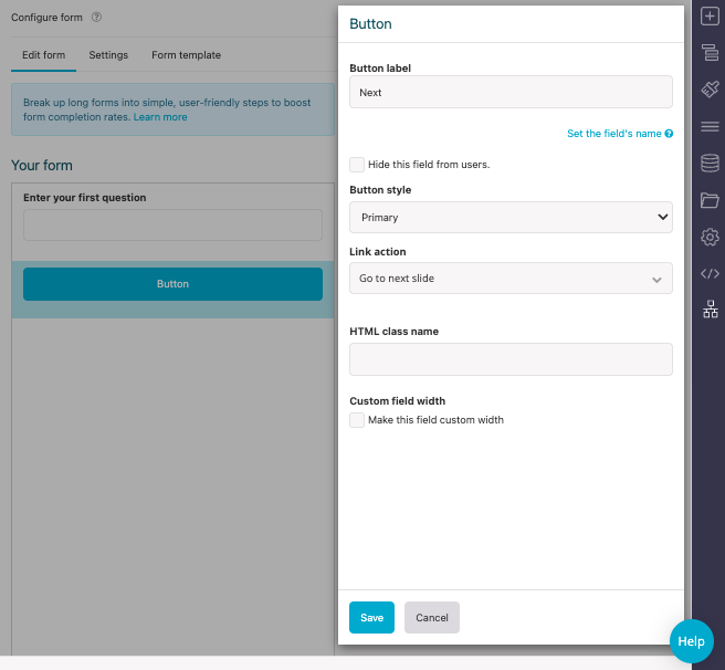
- Click Save, and then save and close
Back Button (Optional):
- Add a button to each slide (except the first one)
- Set the action to “Go to Previous Slide”
- Label the button (e.g., “Back”)
Step 7 – Add the submit button
- On the final slide, ensure there is a submit and clear button
- Making sure it’s connected to the same data source as the previous forms
Step 8 – Preview and test the form
- Click Save
- Enter Preview Mode
- Test the form:
Navigate using the Next and Back buttons
Verify that any required fields validate
Submit the form and confirm data is saved correctly
💡 Tips
- Slide Order: The sequence of slides determines form flow—arrange logically
- Component Compatibility: Some components may not fully function inside the Slider. Refer to the Customizable Slider Component article for guidance
- User Guidance: Use clear labels and indicators to guide users step-by-step
Related Articles
Was this article helpful?
YesNo