What are the appearance settings?
Appearance settings allow you to edit the colors, fonts, and layouts of components and other general settings in your app.
There are two ways to set the appearance of items in your app. You can set them for an individual component or you can apply them to your app’s theme, which will change the appearance settings for all similar components across your app simultaneously.
Get Started
How to use the appearance settings
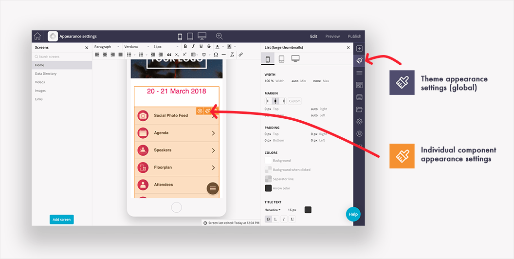
A list of common options is in the article below. These may change slightly based on the component selected. To edit an individual component’s appearance settings – hover over it and click the paintbrush icon. To access the theme appearance settings click the paintbrush in the right-hand menu. Theme appearance settings are great for quickly styling your app and applying brand fonts and colors. Individual component appearance settings are best for fine-tuning your app’s appearance.
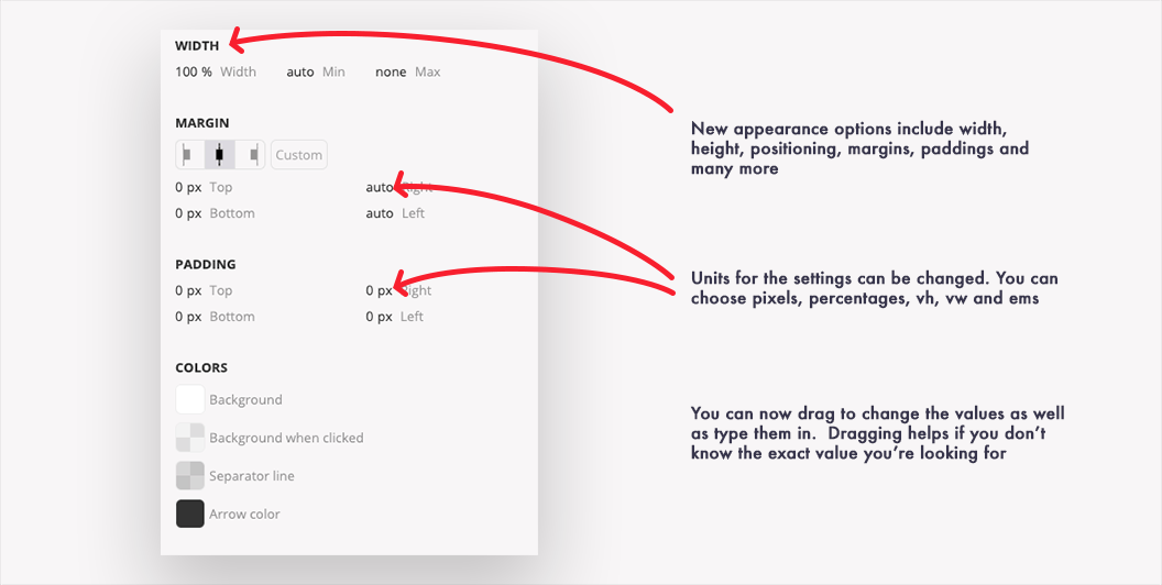
This will open the appearance menu on the right side of the screen. To change a value – you can click to edit it or in some cases, you can click and drag the value. Dragging a value is particularly helpful for things like width where you may not know the exact numerical value required and it’s best judged by eye.
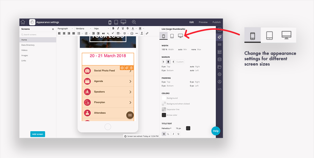
You can also make changes for different display sizes – making a change on mobile will affect tablet and web.
Many of the field values have different options for the value’s units. You can change the units by clicking on them. Below is a summary of the commonly used units:
-
Px is the number of pixels. This is the most commonly used option.
-
Em is a size relative to the element’s parent’s font size. 1em = same as font size
-
Rem is a size relative to the root’s font size. 1rem = same as font size
-
% is the percent relative to the container, typically the whole screen. This is common when you are trying to make the app responsive across many different display sizes.
-
Auto will create sizing or spacing automatically
-
None will not use the selected value
Why use appearance settings?
From the appearance menu, there is a quick settings option that will change default colors and fonts across all components. You can edit more general options, menus, and all the components of the same type, say primary buttons, by expanding that option. You can also edit components for specific types of displays: mobile, tablet, and desktop.
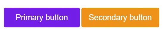
However, anytime you want to edit a single component’s appearance, you can use the component’s appearance settings. For example, if you had two buttons together on a screen, and wanted them side-by-side, you could edit those two buttons to be 50% width and enable row sharing by clicking the  icon in the positioning section, allowing them to be on the same row. This way, it wouldn’t resize or move all the buttons across your app.
Options of the Appearance Menu
Across the top, you will see options for Mobile, Tablet, and Desktop. This will allow you to change the options for each; however, by default, tablet will inherit the settings from mobile, and desktop will inherit from tablet. These settings may change for different components.
|
Width and Height |
The overall width and height of the component.
|
|
Position |
Where the component is on the screen. The icons let you choose what the position of the component is based on:
|
|
Margin |
The spacing around the outside of the component. Some components have icons that let you set them to left, center, and right without having to change the values. Or you can manually set top, bottom, right, and left. |
|
Padding |
The spacing on the inside of the component. Set top, bottom, right, and left. |
|
Border |
The lines around the outside of the component.
|
|
Shadow |
This is a shadow effect around the edge of the component.
|
|
Font Style |
Different components may have different font options for headings and other text types.
|
|
Colors |
Different components have different color options with a standard color picker. |
|
Background |
Set None for no background or choose a simple color or an image. The image option has several settings
|
Related Articles